Update SPFx webpart Properties
Customize SPFx webpart Properties
In this post we will see how to customize SPFx webpart properties & code to be updated.
Titles covered:
1. Files & methods used for webpart Property
2. Bind Webpart Property values in Code
3. Field types used in Property Pane
4. Adding new properties 'ListTitle' & 'ListUrl' in same group
5. Adding Validation to the Properties
6. index-internal.d.ts file uses
6. Adding Dropdown type Webpart property
7. Adding Slider type Webpart property:
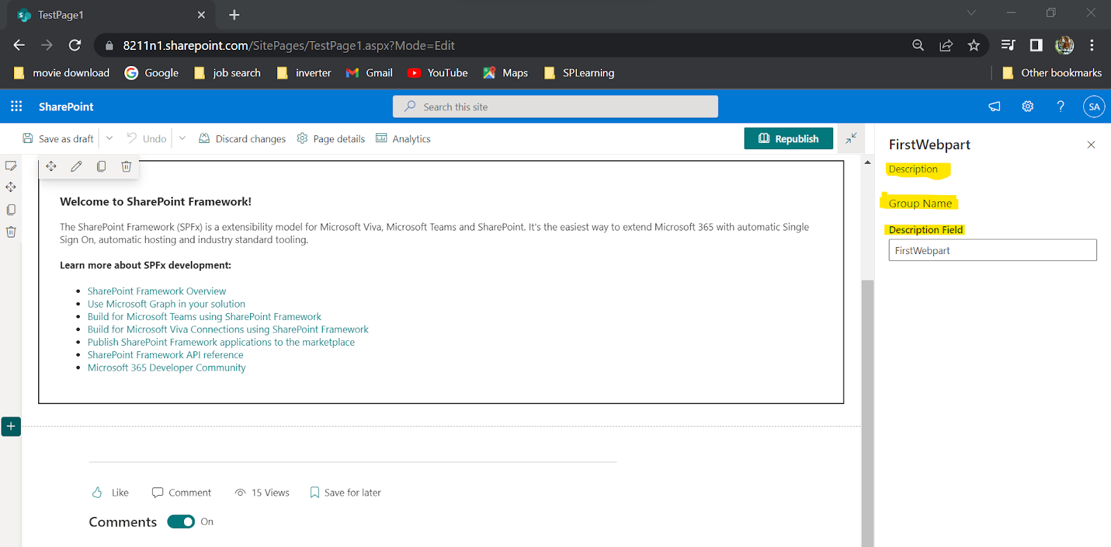
1. Files & methods used for webpart Property(ex. "Description" property)
src/WebPart.ts
1. References added from -> import from '@microsoft/sp-property-pane'
2. Under interface(IWebpartWebPartProps) declare the property "Description"
3. Implement the property in getPropertyPaneConfiguration() method
After this webpart property heading, group name, label text are declared in below files.
(Note: we can also directly hardcode the names in Webpart.ts file)
Take reference from 'index-internal.d.ts' to find default options for Slider:
Code to add Slider Property
src/WebPart.ts (getPropertyPaneConfiguration() method - define and implement properties)
src/loc/mystrings.d.ts (IWebPartStrings Interface - declare property Heading, group name etc... )
src/loc/en-us.ts (define([] array - adding string values for the property Heading, group name etc...)
(Note: we can also directly hard code the label values without using above 2 files)
2. Bind Webpart Property in Code
In Render() method we can add this code to get the webpart property & it will bind values dynamically.
${escape(this.properties.description)}
Now we will add more properties to the webpart
3. Field types used in Property Pane:
| # | Property field | SPFx Typed Object |
| 1 | Label | PropertyPaneLabel |
| 2 | Textbox | PropertyPaneTextField |
| 3 | Multiple lines of text | PropertyPaneTextField |
| 4 | Link | PropertyPaneLink |
| 5 | Dropdown | PropertyPaneDropdown |
| 6 | Checkbox | PropertyPaneCheckbox |
| 7 | Choice | PropertyPaneChoiceGroup |
| 8 | Toggle | PropertyPaneToggle |
| 9 | Slider | PropertyPaneSlider |
| 10 | Button | PropertyPaneButton |
| 11 | Horizontal Rule | PropertyPaneHorizontalRule |
| 12 | Custom | Our own implementation using combination of above |
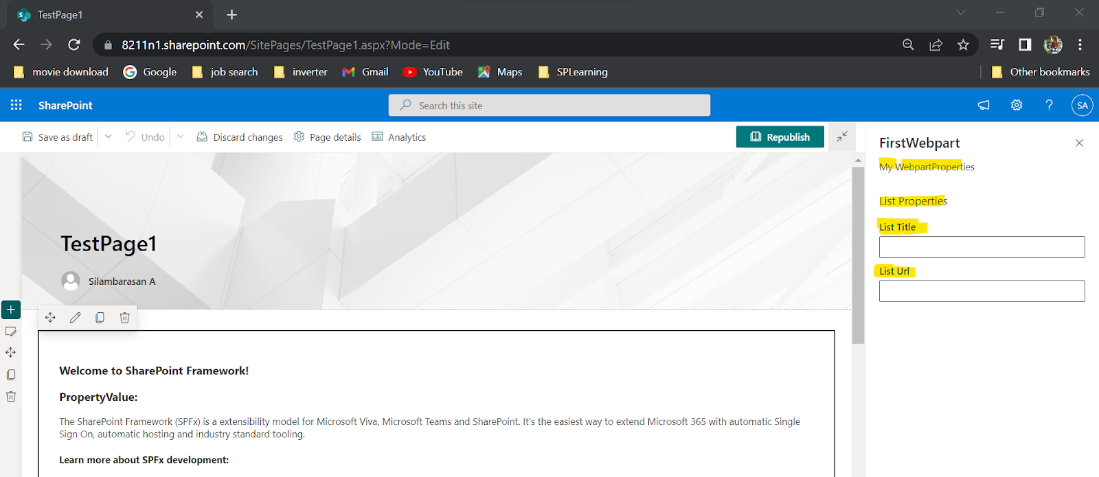
4. Adding new properties 'ListTitle' & 'ListUrl' in same group:
As we mentioned above we will add this properies to
src/WebPart.ts (getPropertyPaneConfiguration() method - Define and implement properties)
src/loc/mystrings.d.ts (IWebPartStrings Interface - Declare property Heading, group name etc... )
src/loc/en-us.ts (define([] array - Adding string values for the property Heading, group name etc...)
(Note: we can also directly hard code the label values without using above 2 files)
For example if list URL is empty then we need to show some some error. We can use this ''onGetErrorMessage" property for text validation.
index-internal.d.ts file uses:
This file is used to find each Webpart Property options(eg. inputs & methods) using 'index-internal.d.ts' file. To open this file easily --> Add 'IPropertyPaneTextFieldProps' under src/webpart.ts & press F12.
And the code is "onGetErrorMessage"
6. Adding Dropdown type Webpart property:
Take reference from 'index-internal.d.ts' to find default options for dropdown:
"IPropertyPaneDropdownProps"
"IPropertyPaneDropdownOption"
And the Actual code to add Dropdown Property:
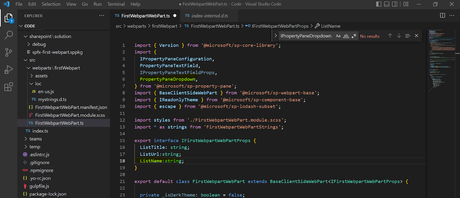
1.Add 'PropertyPaneDropdown' under import & add Property name under interface (ex. ListName)
7. Adding Slider type Webpart property:
Code to add Slider Property
1. Add 'PropertyPaneSlider' under import webpart
2. Add porperty name to get slider under interface(Example: PercentageCompleted)
3. Add slider code under "getPropertyPaneConfiguration()"
Refer this video for more details


Comments
Post a Comment